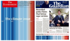
Climate data makes front pages as strikes begin #ShowYourStripes
20 September 2019

A striking global warming image made by a University of Reading climate scientist is on the front pages today of two of the world's most influential English-language newspapers.
The ‘warming stripes' graphic, designed by Professor Ed Hawkins, is featured on the front of both the Guardian and the Economist newspapers today. Both newspapers tell the story of a global day of climate action today, ahead of climate talks between world leaders at the UN in the coming days.
"I am thrilled to see the warming stripes being featured in such high-profile and well-respected newspapers as the Guardian and the Economist, on a day when young people around the world are demanding action on climate change," said Professor Hawkins.
"I hope that the millions of people who see it will stop and think about the reality of climate change, and their own role in finding a solution to an ever-warming planet.
"The power of the stripes graphic is not only that it shows the undeniable effect of global warming over time, but that it represents, in a single image, the entirety of more than a century of carefully assembled scientific evidence.
'The stripes graphic represents, in a single image, the entirety of more than a century of carefully assembled scientific evidence' - Ed Hawkins
"It is made up of billions of individual pieces of data, collected at millions of different points over space and time, by thousands of committed scientists, many of whom are long dead. Yet the story it tells is one that our generation is the first in human history to be able to interpret and understand.
"What the story will be in the future is up to us. Young people today have taken the initiative by protesting and demanding action. Our fate is in our own hands."
The front pages are highlighting a day of global climate action, which includes an officially-supported climate strike by University of Reading staff and students.
The 30-minute stoppage, proposed by student activists and the Reading branch of the Universities and Colleges Union (UCU), was backed by Vice-Chancellor Professor Robert Van de Noort and will see Reading staff and others downing tools, with options to participate in environmental activities.
Professor Hawkins, from the National Centre for Atmospheric Science at the University of Reading's Department of Meteorology, first created the image in 2018 to show how the world's average temperature has changed from the average over the past 150 years - with each year represented by a vertical coloured stripe. Warmer years are indicated by red, and cooler years by blue.
In June this year, Professor Hawkins went on to create the showyourstripes.info website, with Reading's Institute of Environmental Analytics, from which more than one million graphics have been downloaded.
The graphic also featured on the main stage of this August's Reading Festival, attended by 105,000 music fans, during a set by rock band Enter Shikari.
